Undercover Safer Sex Visual Identity
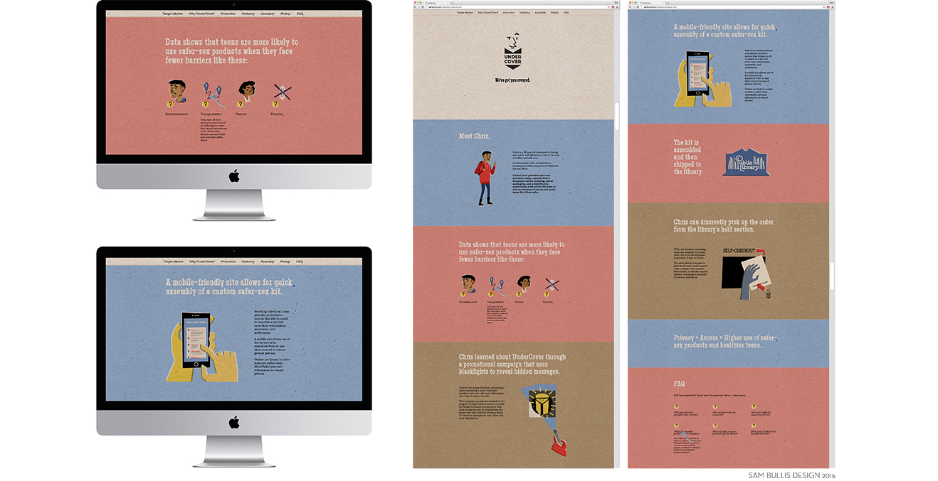
While the internet has given modern teens access to a wealth of safer-sex education information, many of them still face barriers to access when seeking the safer-sex products they need to put that knowledge into action. This includes a lack of funds or transportation, restrictive parenting, and sometimes just plain embarrassment around sexual health.
UnderCover reduces these barriers with a strategy that leverages a discreet web ordering system and distribution at public library checkouts to give teens a private and easy-to-access link to the products they need.
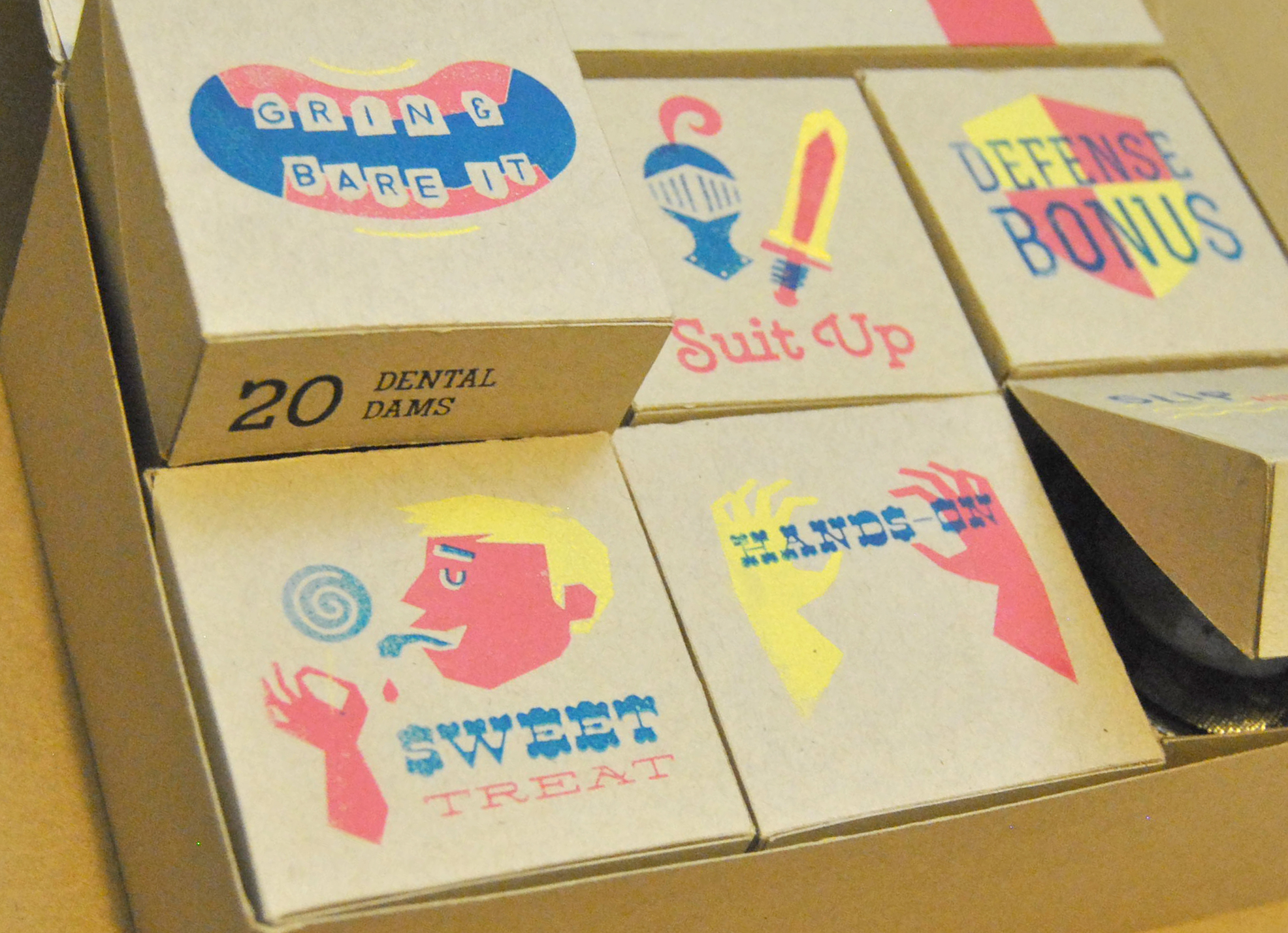
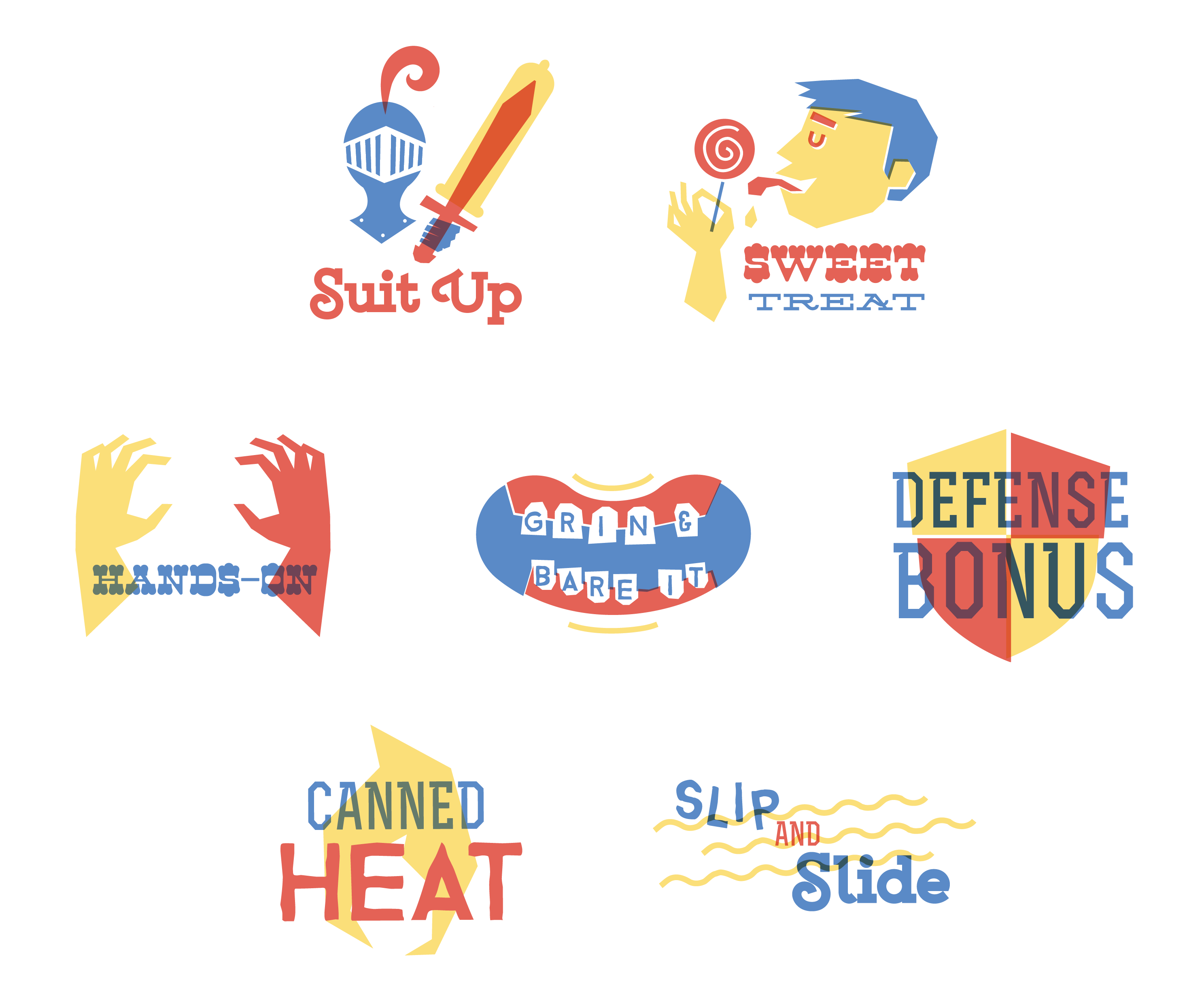
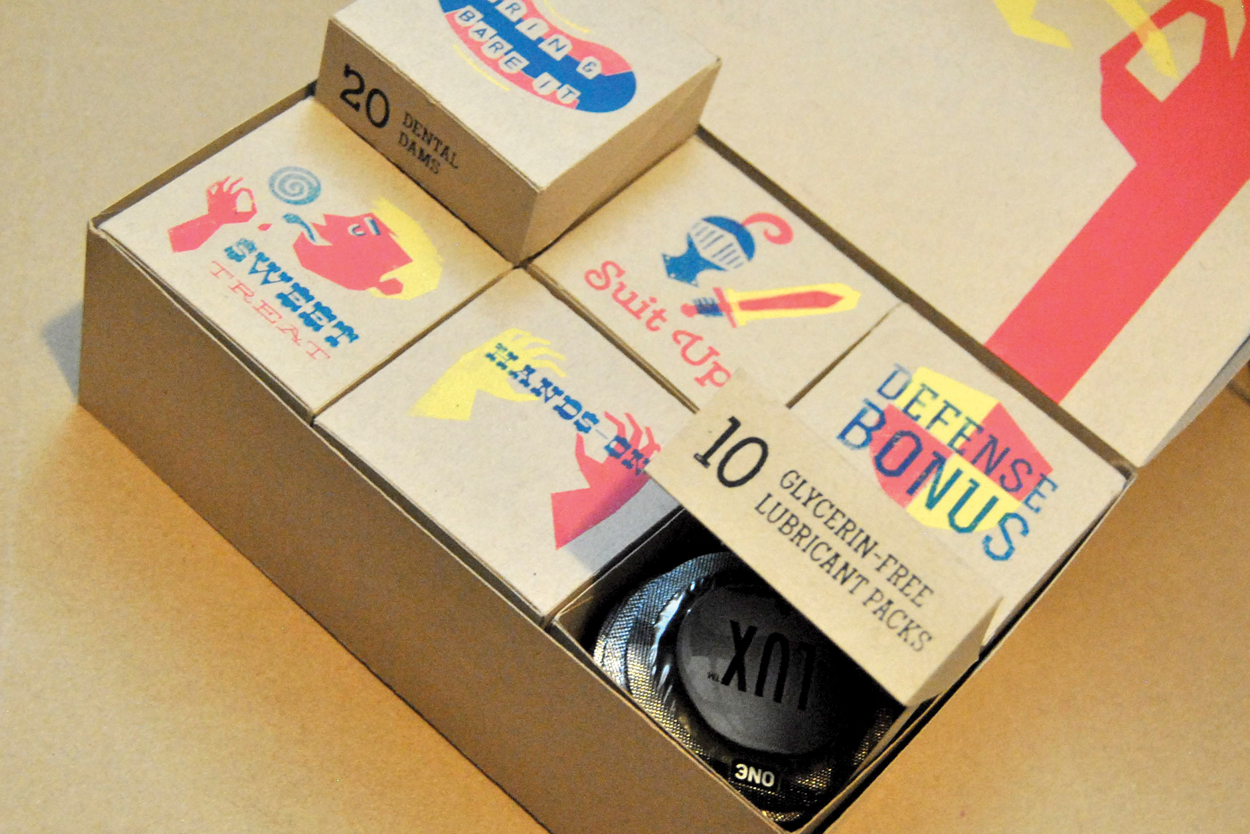
While the distribution strategy is discreet on the outside, inside the plain paper package is the real branding: pure fun and humour. Using a palette and type scheme that draws on midcentury and UPA references, each category of item is branded with funny product category names and friendly illustrations to build a positive, supportive tone.
This project contains several animations and may take a few moments to load.
Studio
Sam Bullis Design
Client
Personal Initiative
Recognition
RGD Student Awards Honourable Mention in Digital Marketing, Adobe Design Achievement Awards Semifinalist in Social Impact Design


Check out the website below:
(It may take a few moments to load all elements)
Check out the website below: