Maison Boncompain Visual Identity
Maison Boncompain is a patisserie that bakes traditional small-batch Canelés de Bordeaux. They needed an identity for their brand that expressed the fun of their pastry experience while maintaining a connection to the distinctive warmth and appearance of the traditional French Canelé.
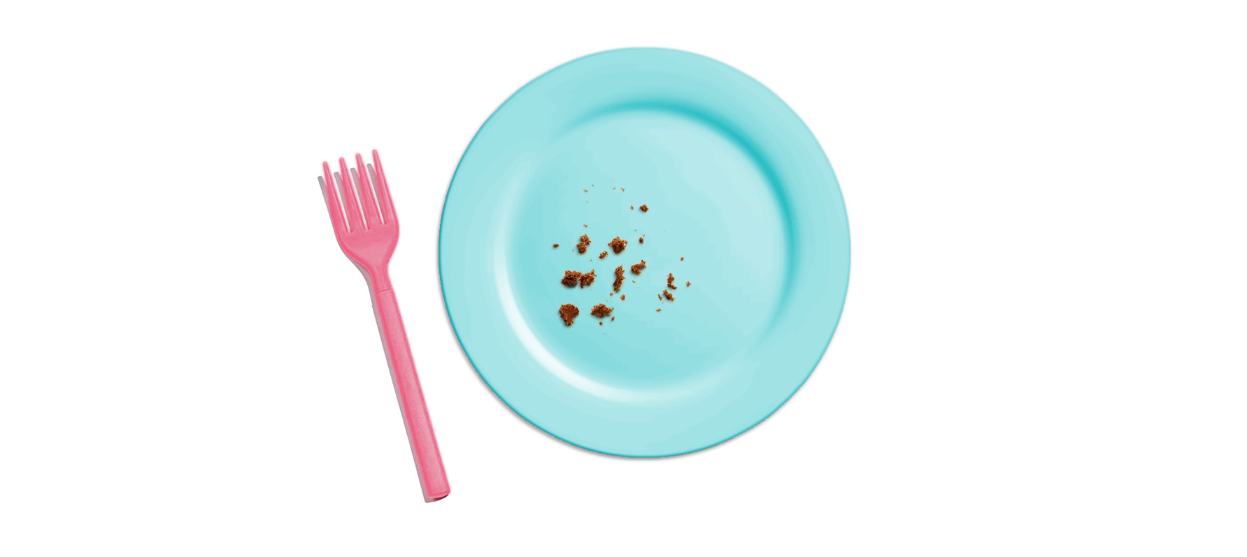
It was important to distinguish the identity from the minimalist white packaging and fine script lettering common in the category, and particularly from the pastel tones that usually signal macarons. To achieve this, the brand personality was to express the fun of the experience of consumption of this treat rather than leaning too heavily on traditional cues of luxury pastry.
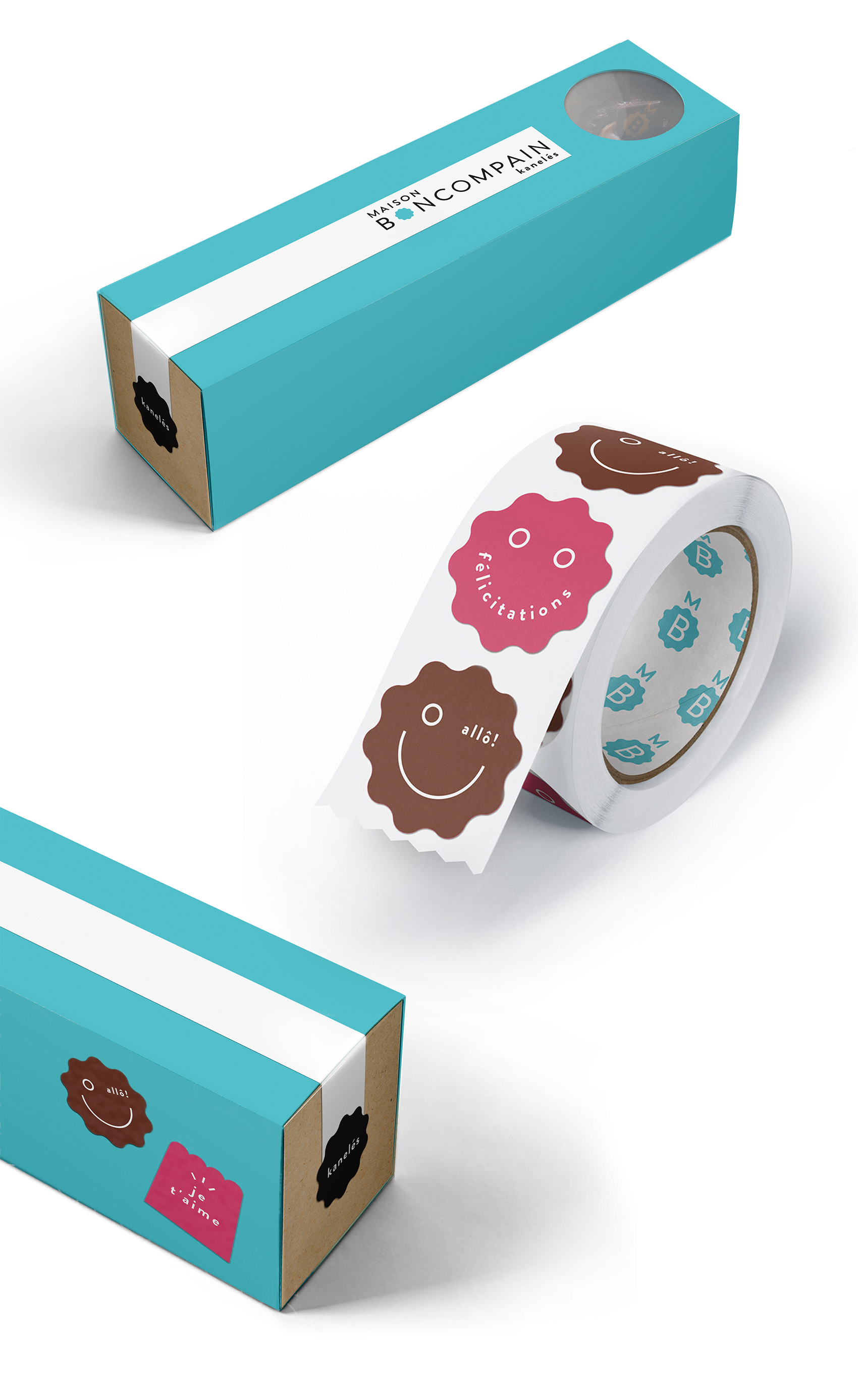
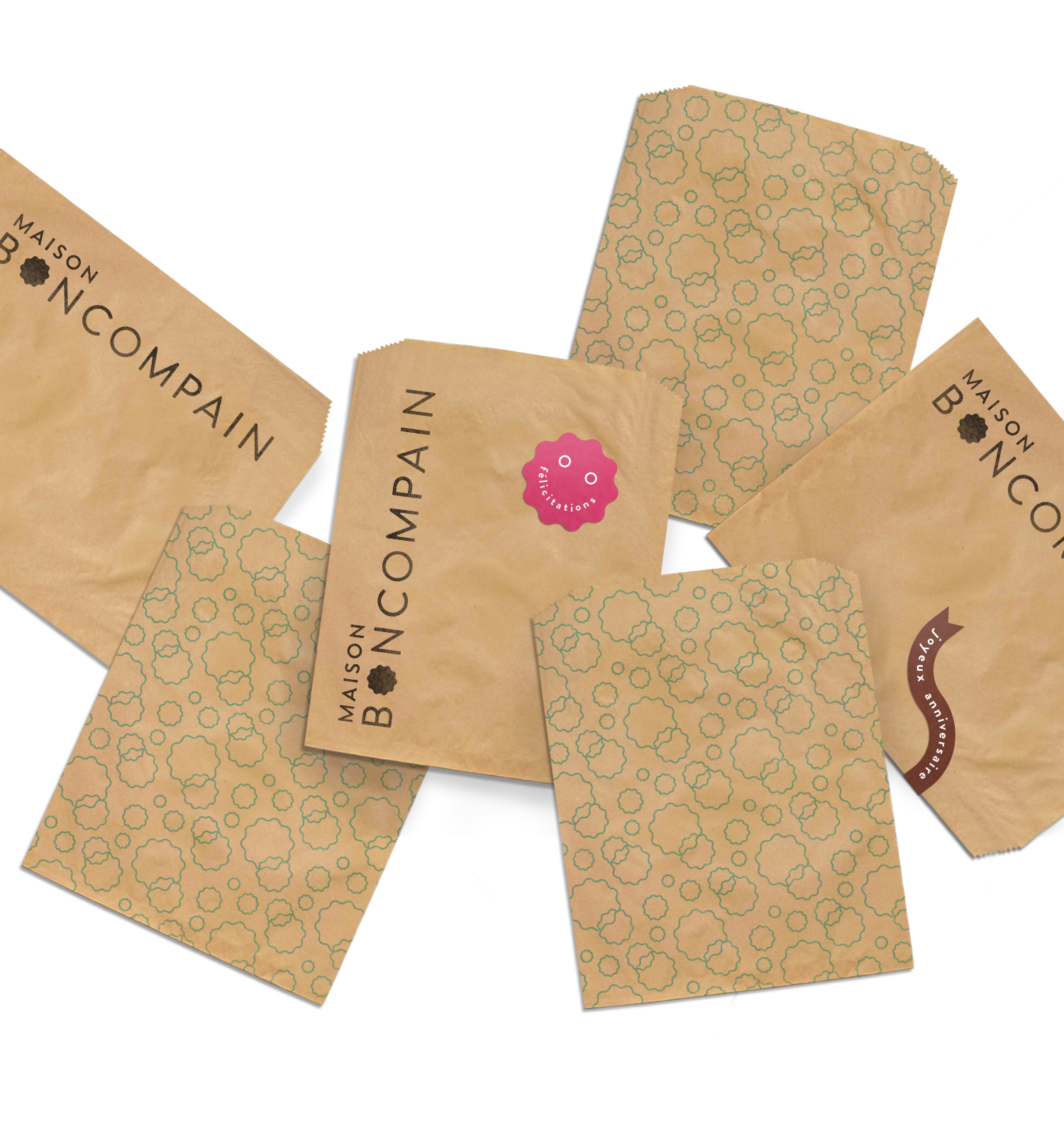
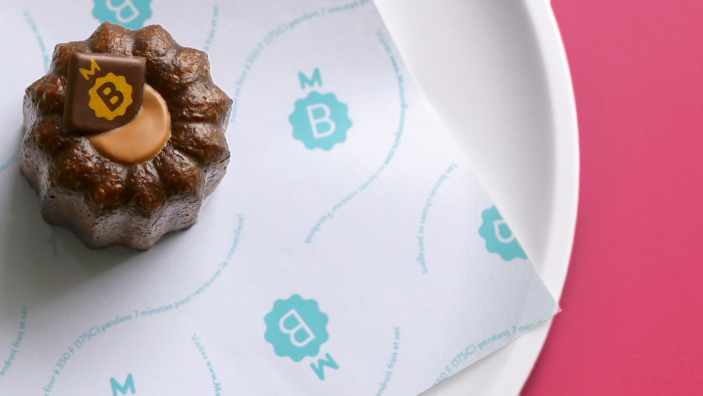
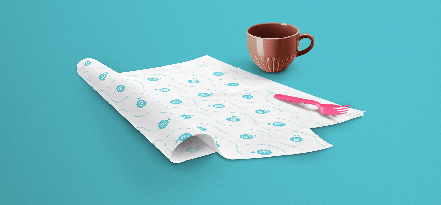
The warm colour, flavours and scalloped shape of the Canelé are reflected in the primary brand shape and colour system, and in the textures of the kraft paper elements. Vibrant accent colours and expressive stickers and tissue paper prints weave a more playful tone into the experience.
Studio
Le Parc @ Juniper Park\TBWA
Creative Direction
Nathalie Cusson
Client
Maison Boncompain
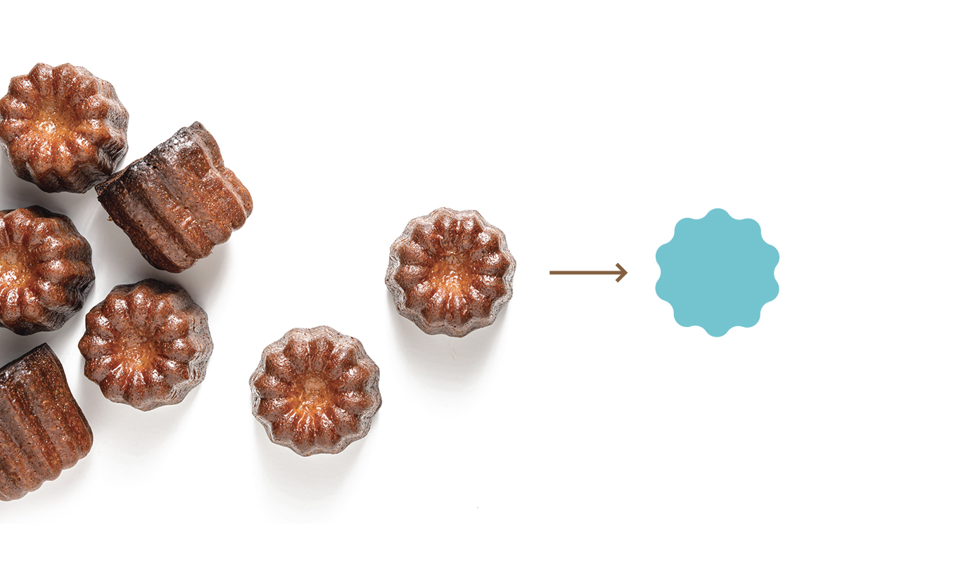
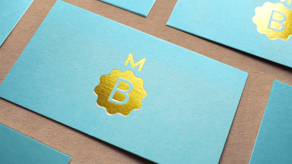
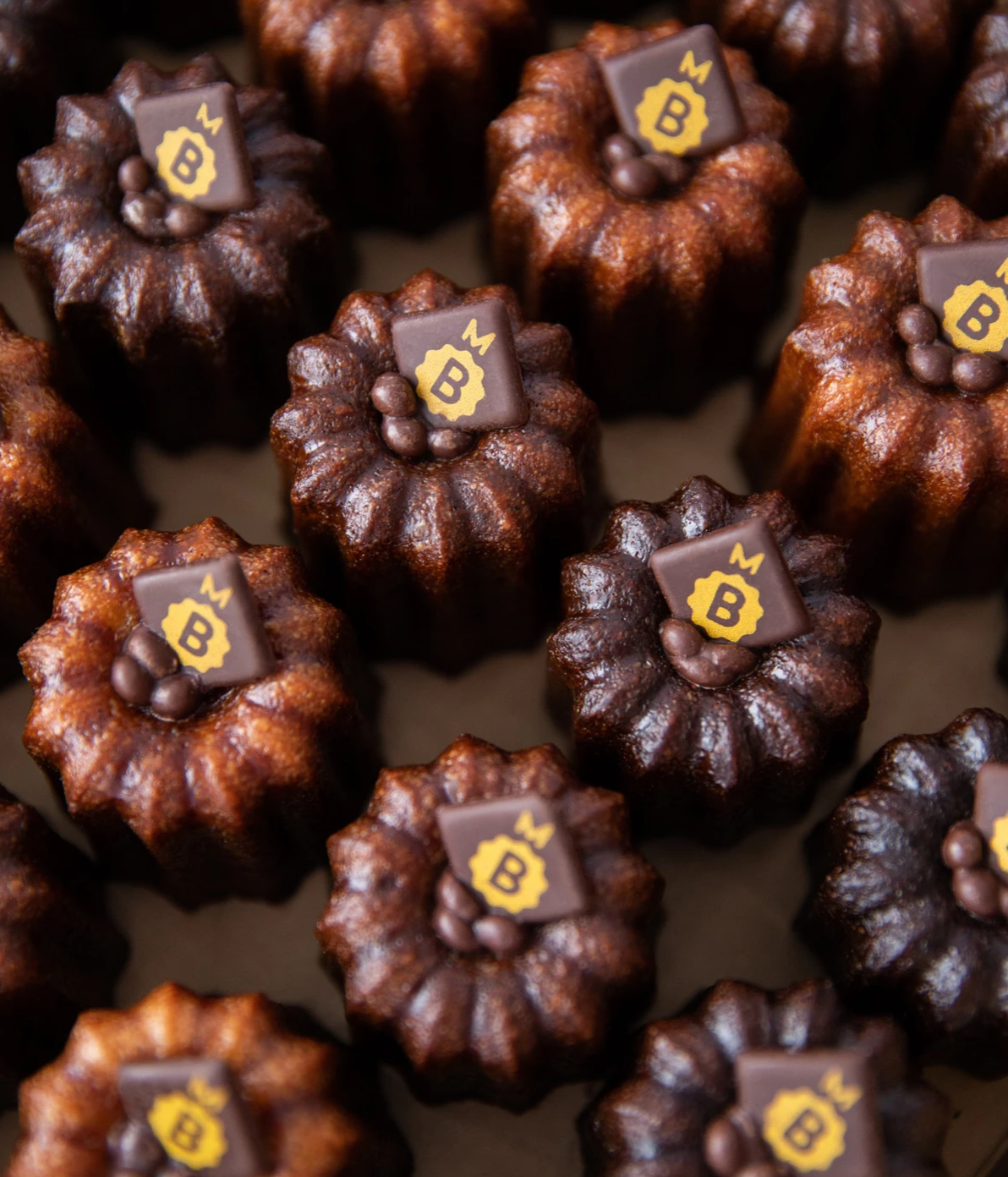
The system all starts with the iconic shape of the aerial view of the canelés.
Word mark
Monogram
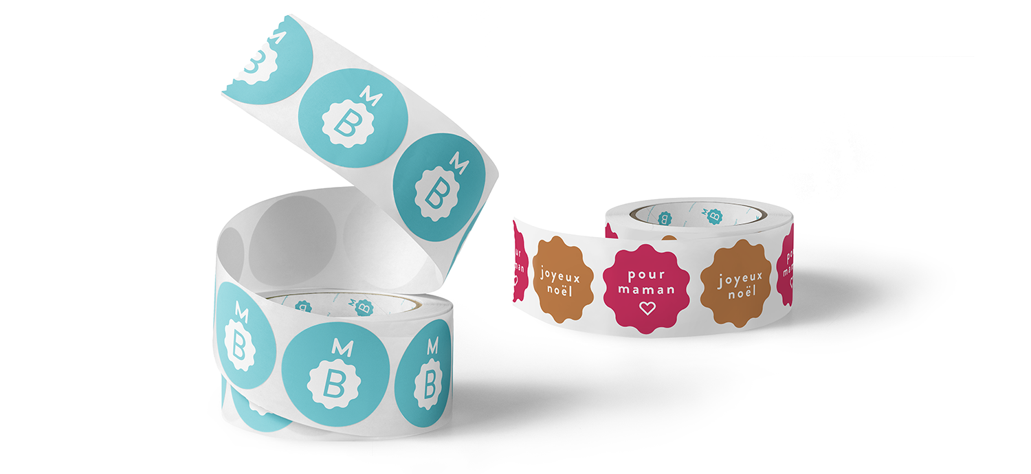
Playful occasion and greeting stickers are an opportunity to add an optional extra kick of personality to packaging (or anything else you like!).
The system all starts with the iconic shape of the aerial view of the canelés.
Word mark
Monogram
Playful occasion and greeting stickers are an opportunity to add an optional extra kick of personality to packaging (or anything else you like!).
